
In the second episode of the first season of Dissabte d’Arravalera, we presented the talk “Graphic Identity for Politically Engaged Projects: The Cases of Metzineres and L’Arravalera.”
The conversation brought together Andre Gaetano, photographer and illustrator at Metzineres, and Silustra, the illustrator responsible for developing L’Arravalera’s visual identity. Together, they explored the creative processes behind both projects and opened a discussion with attendees about representation, stigma, territory, and political communication.
During the event, we also opened the exhibition “UNIVERSO ULISES. 1997–2026”, turning the space into a place to share graphic art, memory, creativity, and experiences.
Visual Identity as a Political Position
Visual identity defines how a project presents itself, which stories it brings into circulation, and how it establishes relationships with its surroundings. It can build recognition, engage diverse audiences, and turn a political position into an everyday experience.
At L’Arravalera, graphic design is part of our cultural and community work. It appears across social media, exhibitions, workshops, the storefront, clothing, posters, and objects produced within the space. Each medium expands the conversation and reinforces one idea: things are happening here.
The identity needed to express the project’s vibrant character and its connection to the margins. The aim was to develop a distinctive, recognizable, and flexible visual language. A graphic identity capable of movement and deeply connected to its territory.
Looking to the Neighborhood to Build an Identity
The creative process unfolded through a series of meetings, walks, and explorations. It began by gathering references that could connect L’Arravalera’s identity to the Raval’s graphic and social history.
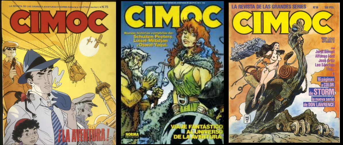
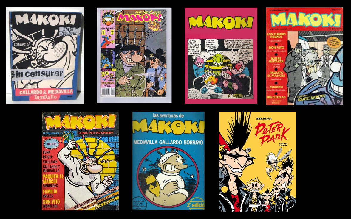
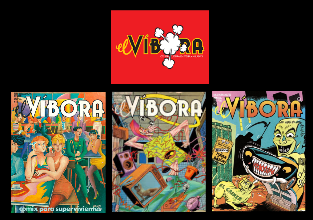
Comics from the period following the dictatorship and countercultural magazines such as Makoki and El Víbora were among the creative inspirations. Their pages offered ways of representing the margins, dissenting identities, nightlife, drugs, and lives excluded from dominant narratives.
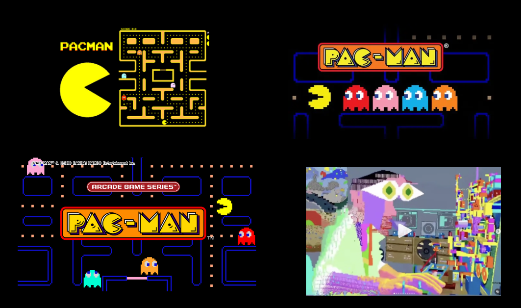
These references were joined by early eight-bit video games and visual worlds such as Pac-Man. Their simple shapes, bold colors, and moving characters provided inspiration for building a dynamic, modular graphic system.
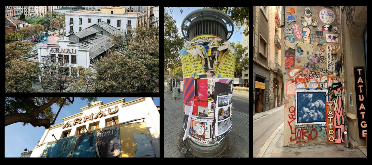
The neighborhood itself completed the archive. Walking through the Raval revealed its walls covered in interventions, overlapping posters, shop signs, façades, bars, and traces left by everyday use. The stencil-style lettering of the Teatre Arnau, construction-site stripes, saturated colors, urban signage, and layers of posters provided elements connected to the neighborhood’s collective memory.
The identity began to take shape through this combination: comics, digital culture, drug use, commerce, memory, street life, and counterculture.
From Research to a Visual System
The initial research led to three graphic proposals. Each explored different relationships between typography, illustration, color, texture, and urban elements.
The selected direction made it possible to develop a system based on solid colors, strong contrasts, bold typography, and dynamic compositions. Neon brings visibility and connects with the neighborhood’s nightlife and commercial visual codes. Textures work like traces: individual marks that form part of a collective identity.
The logo incorporates irregularity and movement. Its letters seem to shift, stretch, and occupy space at different rhythms. This structure allows it to adapt to different formats while maintaining a recognizable presence.
L’Arravalera’s identity is therefore conceived as an open system. Its elements can be combined, moved, and adapted to each activity while maintaining a consistent visual and political language.
A Universe of Possible Meanings
The illustrations bring together different symbols, connecting the project’s political perspectives with accessible images that remain open to multiple interpretations.
The umbrella references sex workers’ struggles. The butterfly represents trans identities, transformation, and movement. The house built from individual pieces speaks to housing and the struggle to exercise this right, community, and structures built collectively. The eyes evoke drug use, perception, and psychedelic states.
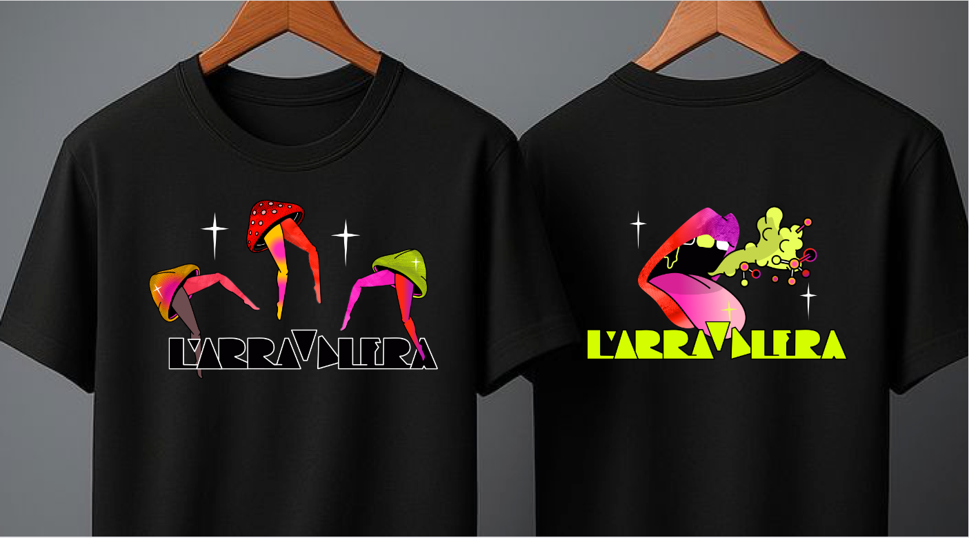
Open mouths, eyes, molecules, mushrooms, bodies, bricks, and everyday objects also appear. Each element belongs to a visual universe connected to the experiences, debates, and communities that shape L’Arravalera.
This approach makes it possible to communicate the project’s complexity without reducing it to a literal image. Each symbol creates associations and opens up new interpretations. The identity grows through its applications and through the meanings given to it by those who encounter it.
Graphic Design to Create and Share
L’Arravalera’s identity is designed to circulate across different media: social networks, posters, storefronts, fabrics, and everyday objects.
During the first Dissabte d’Arravalera, we organized a free screen-printing activity, a technique that makes it possible to transfer illustrations onto these materials through a hands-on, accessible, and collective process. Participants could bring their own clothing or customize a tote bag and take home their printed piece. We used a screen-printing frame and offered two vibrant colors: green and red, both part of L’Arravalera’s visual identity palette.
From the very first gathering, we wanted to reduce the distance between hosts and guests. Printing together, sharing the process, and transforming a piece of clothing became a way to connect and actively participate. A simple way to begin building a collective sense of “us.”
From Inside the Space to the Street
L’Arravalera’s storefront acts as an extension of the project into the neighborhood. Its transformation for the first Dissabte d’Arravalera brought the visual identity onto the street through bold colors, illustrations, and stripes inspired by urban signage.
These stripes increased the contrast and delivered a direct message: things are happening here.
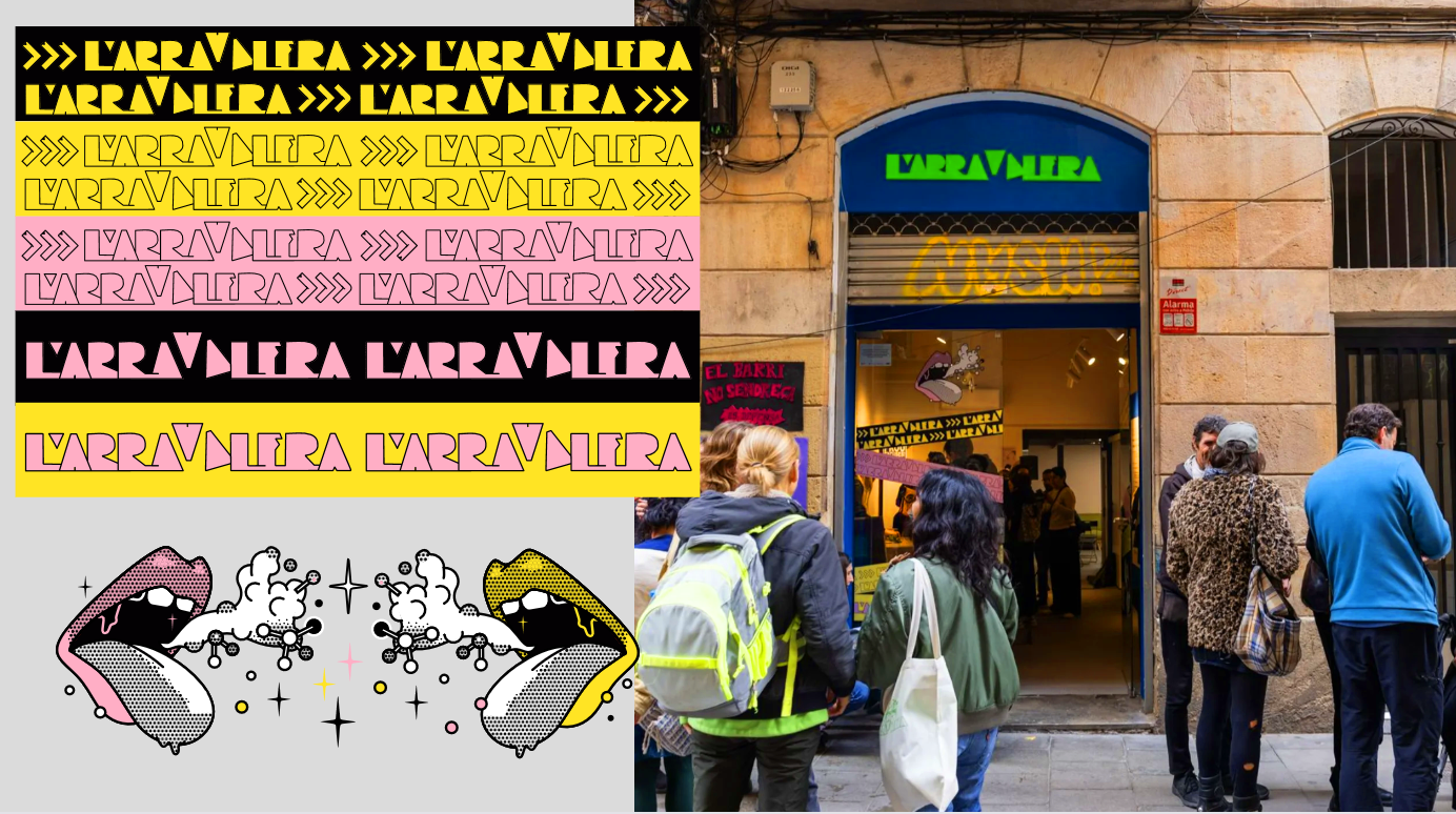
The graphics signal an active, vibrant space, spark curiosity, and invite people to come closer. The relationship with passersby begins even before they walk through the door. The storefront becomes both a communication medium and a surface for urban intervention.
T-shirts, bags, posters, and other merchandise bring the graphic universe into everyday objects. These applications allow the images to circulate through other spaces, spark conversations, and contribute to the project’s sustainability.
At L’Arravalera, visual identity supports a concrete practice: building community from the margins, challenging stigma, and opening spaces to talk about activism, rights, sexualities, violence, care, pleasure, and culture.
Images carry these conversations onto a T-shirt, a label, a storefront, a social media post, or a screen. They connect the space to its territory, foster a sense of belonging, and sustain shared memory. Building L’Arravalera’s identity is also a way of intervening in the Raval.
With the support of